How to create a convincing CTA (call-to-action)
In order to generate sales and to see growth in your customer base, your website will have to include CTAs (which stand for Call-To-Action) that are efficient and will succeed in fulfilling their role.
But how do we create calls to action that will generate a good conversion rate?
A call-to-action with a clear objective
Although it may seem obvious, this tip is not always taken into consideration. Indeed, a call to action saying "Click here" does not specify what the user can expect by responding to this request. So, why would it? To motivate a concrete action by a visitor on your website, the result stemming from answering the call to action must be clear and unequivocal.
Therefore, choosing phrases and expressions such as "Subscribe here" or "Get a quote" is much more evocative as the person that clicks has a clear idea of what will happen when they click on your CTA.
A pictogram? Why not?
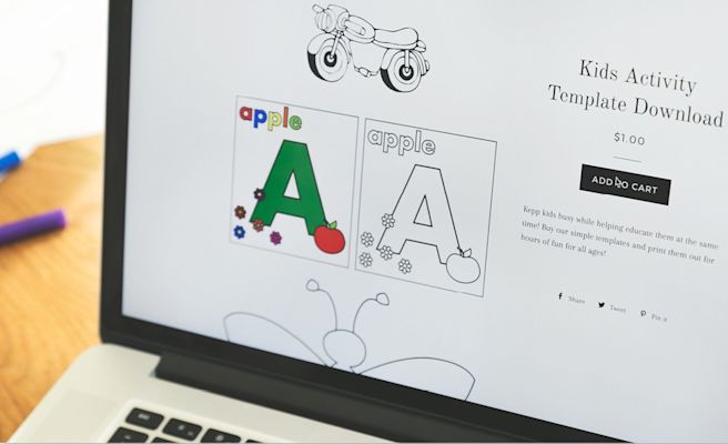
In keeping with the idea that was presented in the previous point, it may be advisable to include a pictogram to make the purpose of the call to action even more easy to identify. The most common example found on e-commerce websites, and that has proven its worth over time, is the small shopping cart that implies completing a transaction. Keep in mind that a picture is worth a thousand words...
Example from RenoQuotes.com
A call-to-action that is concise
In this regard, it important to keep in mind that the goal of a CTA does not amount to sharing detailed information, but rather to invite the visitor to act in a certain way. Incidentally, your reader should already have all of the necessary information to make a decision concerning their desire to provide a favourable answer to your request (or not). Logically, your call-to-action should be concise and not go past 5 words.
Choosing an action verb
Without a doubt, your call-to-action must contain a verb that incites to act, such as "download", with the preferred wording employing the imperative mood.
Looking for an expert to help you optimize your website?
Contact us so we can refer you to specialists in our network
Using an action button that creates a sense of urgency
If your CTA concerns a promotion, it may be interesting to highlight a sense of urgency. The feeling of having to act relatively quickly so as not to miss the offer can definitely work in your favour. Don't forget that when something is rare or only available for a short time, the stronger the visitor's desire to click will be.
Avoid overusing CTAs
What should we do when there is more than one choice? Before making a decision, it will be important to take the time to consider the options and to analyse each one.
The wider the range of possibilities, the more difficult the decision will be. Consequently, it may be that the effort required by these choices and the fear to make the wrong decision will cause the visitor to quit, which clearly goes against the initial idea.
A call-to-action that is neither too big nor too small
To bring about concrete action, your call-to-action must be obvious. Regarding other elements located on the page, it must be the right size so that it becomes impossible not to notice it. However, be careful not to go overboard: a CTA that is too big will seem aggressive and overtly evocative, which will be more repelling than inviting.
Making a CTA visible with contrasting colours
With regards to the colour used for the call-to-action, the text colour must contrast with that of the background, without being a shade that is not a part of the website's colour scheme. Otherwise, the overabundance of colours will create a lack of coherence on the website.
To optimize your call to action: test, test, test!
How can you improve your CTA's conversion rate? As mentioned in a previous article, A/B testing can tell you a lot about whether a different version of your CTA would work better than the one you currently have.
There's nothing better than testing several versions in order to find the one that has the best conversion rate. During your A/B test, make sure you take into account each of the factors that could influence the conversion rate: the size, the wording, the placement, the colour. Also, remember that the different versions should only differ in one way so that you can clearly identify the factor that makes the whole difference in terms of your CTA's efficiency.


